Work / Brand Strategy & Identity
Inclusive Parenting is an education-led organisation supporting parents with disability, their families, and the professionals who work alongside them. We built a complete identity system so the brand communicates trust with clarity at every touchpoint — calm structure, clear hierarchy, and a restrained palette balancing credibility with warmth.
The challenge
Inclusive Parenting needed an identity that could carry serious, education-led information without feeling cold or institutional. The system had to stay clear and accessible across a wide range of formats, audiences, and topics, while remaining consistent enough to build long-term trust.
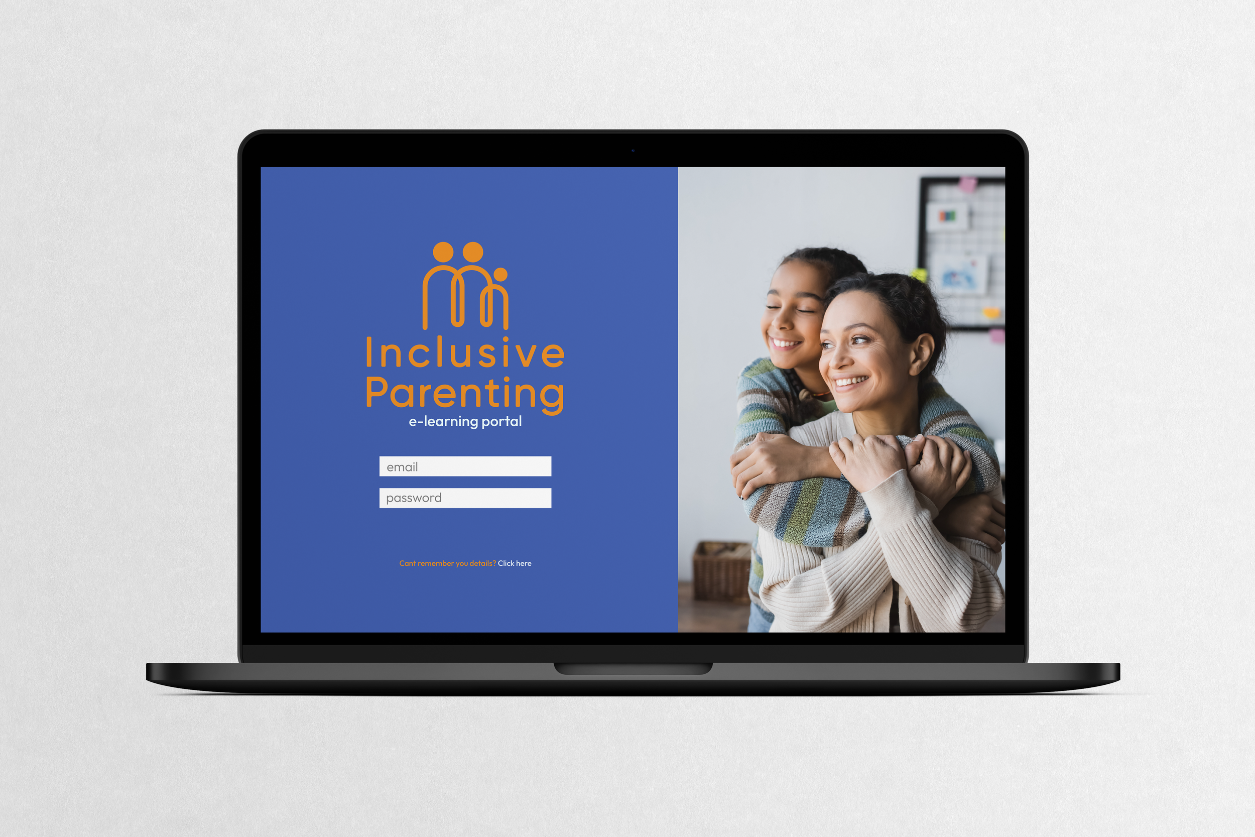
Credible, calm, and modern. It should immediately read as a trusted, education-led organisation — not a casual community page and not a clinical service.
By prioritising hierarchy and legibility. Simple layout rules, consistent spacing, and restrained design decisions so information stays easy to scan, read, and understand.
The identity is built as a repeatable system, not a one-off look. It holds across web, documents, education resources, and social because the rules stay consistent and the components are flexible.
Through control, not decoration. The brand leads with clarity and structure, then softens with considered colour and human tone so it feels supportive without losing credibility.
Clear guidelines and limited variables. A defined logo suite, a restrained palette, and a tight typography set mean the brand stays coherent, even as the content expands.

The mark
The symbol is formed from a single continuous line, creating a unified family structure. It communicates connection and shared support without relying on literal or clinical cues. The mark is minimal, recognisable, and designed to hold integrity at both large and small sizes.
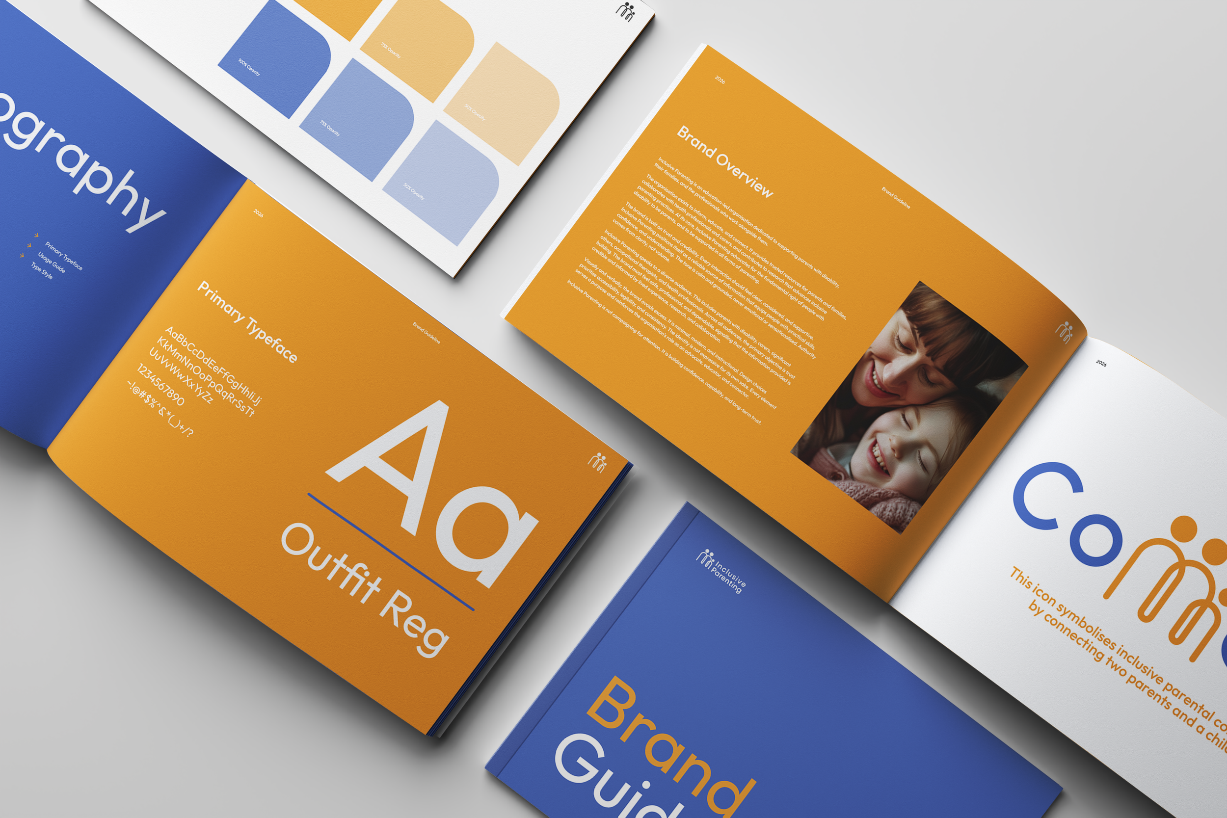
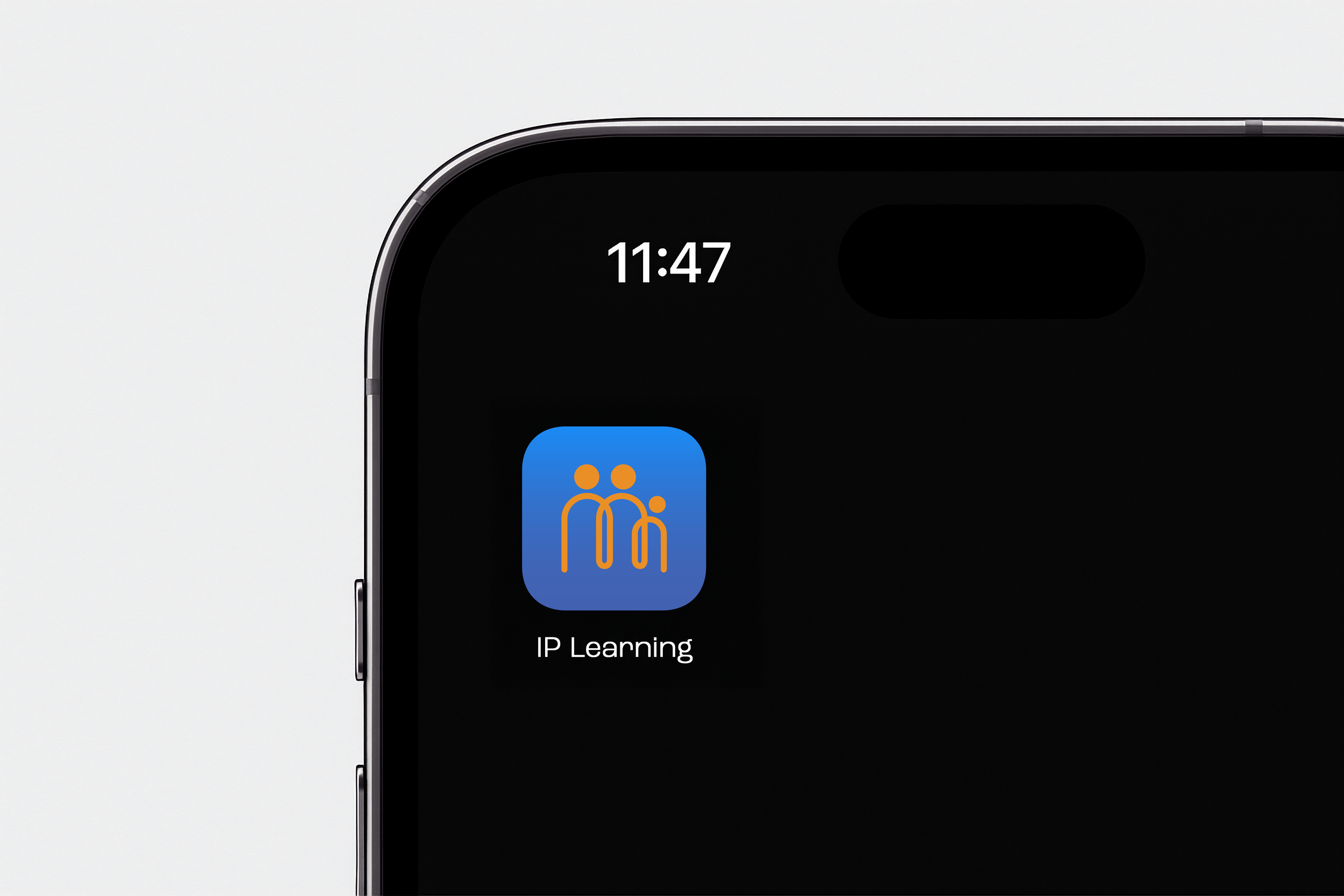
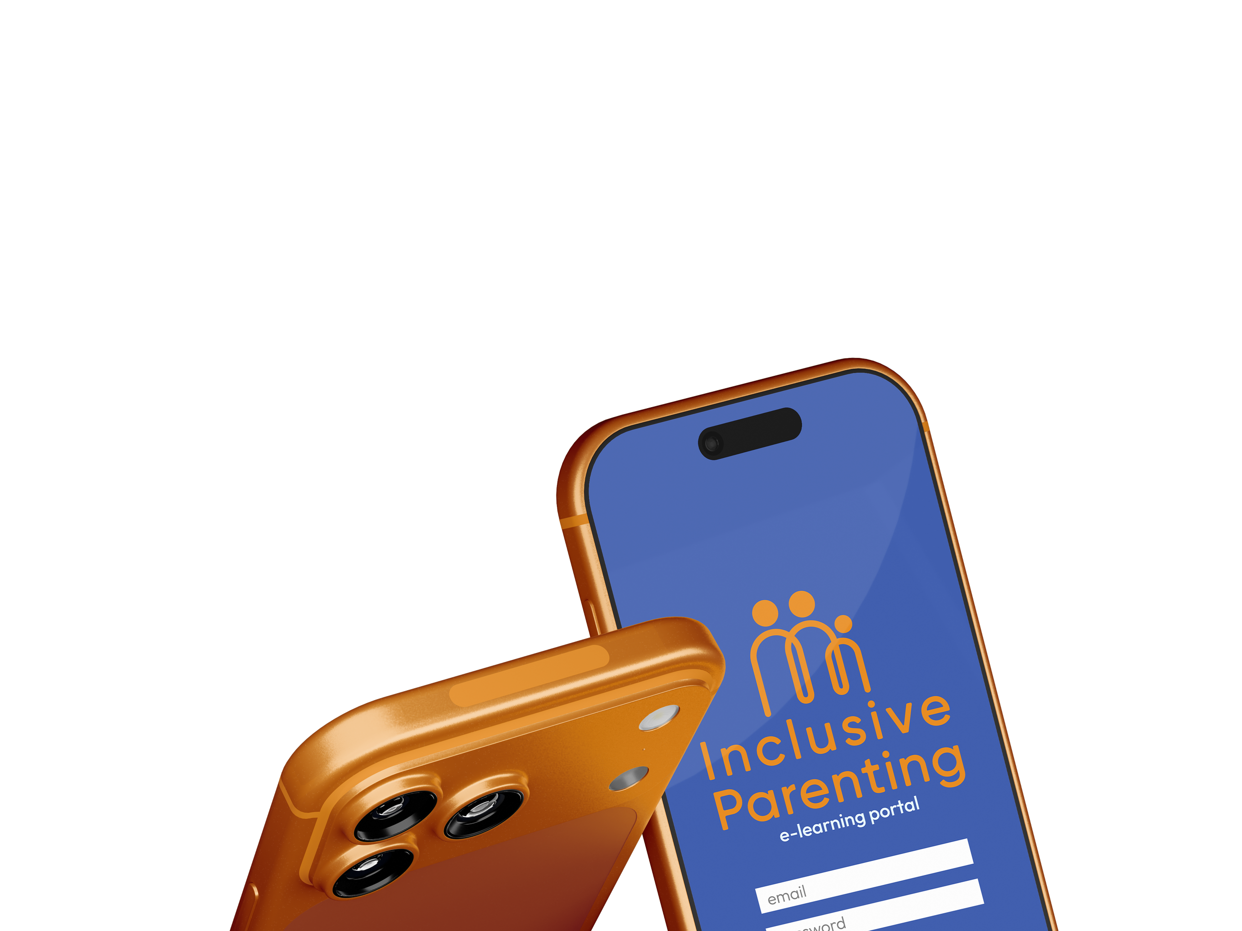
A modern, dependable identity that communicates trust with clarity and stays consistent across every format, with a composed presence that supports education-led communication and builds familiarity over time.
Start a project